Creative Background Design Ideas for Food Menus
In the competitive world of food and hospitality, presentation is everything. One of the most overlooked yet powerful elements of a customer’s first impression is the background design for food menu. Whether you’re running a trendy café, a fine-dining restaurant, or a cozy food truck, the way your menu looks can influence how customers perceive your brand, the food you serve, and even how much they order.
Why Background Design for Food Menus Matters
The background of a food menu isn’t just about aesthetics. It plays a crucial role in branding, readability, and emotional appeal. The background sets the tone, supports the text, and draws the customer’s eyes to important sections. A thoughtfully designed menu background can subtly guide behavior, from encouraging upsells to evoking appetite.
Visual Themes That Reflect Your Brand
Every food establishment has a personality, and your menu should reflect it. The background is where this personality begins to speak. Are you running a rustic bistro, a sushi bar, or a modern fast-casual eatery? Your background design for food menu must align with this theme to keep your brand consistent.
Vintage Charm for Classic Dining
A vintage-style background often includes aged paper textures, sepia tones, or soft woodgrain. This style evokes tradition and warmth, ideal for steakhouses, diners, or family-style restaurants. Add soft patterns like damask or faded script for an old-world charm that instantly feels familiar.
Minimalist Modern for Trendy Cafés
White space, clean lines, and subtle gradients dominate minimalist backgrounds. This style keeps attention on the food and is perfect for coffee shops or smoothie bars that want to highlight simplicity and quality. Incorporate pale greys, beiges, or pastel tones for a touch of sophistication.
Industrial Textures for Urban Eateries
If your brand embraces an urban, edgy vibe, consider using concrete, brick, or dark metal textures as a background. These visuals give an authentic, grounded feel that’s perfect for breweries, food trucks, or gastro pubs. Use bold typography over these backgrounds to maintain readability.
Botanical or Organic Vibes
Earthy textures, watercolor leaves, or light floral designs can complement plant-based, organic, or health-conscious menus. These backgrounds work especially well when matched with handwritten fonts or soft colors like sage green, terracotta, and sky blue.
Texture and Material-Inspired Backgrounds
Sometimes, less is more—but “less” can still be interesting. Background textures inspired by materials such as paper, linen, slate, or bamboo can provide subtle depth without distracting from the text.
A crumpled parchment paper background can make your menu feel handmade and personal. Slate or chalkboard-style backgrounds add contrast, especially when used with white or brightly colored text. Fabric-inspired textures like linen or jute work beautifully for homestyle or artisan-focused restaurants.
Cultural and Regional Influences
Designing a menu for a specific cuisine? Use background design for food menu to hint at cultural elements without overwhelming the layout. Subtle patterns from tilework, textiles, or natural scenery can reflect a region’s character while keeping the menu legible.
For example, Mediterranean menus might feature light sand-colored backgrounds with faint blue mosaic motifs. Japanese restaurants might include a rice-paper texture with soft ink brush strokes. Mexican cuisine could be accented by vivid, earthy tones like chili red or cactus green, paired with Aztec-inspired patterns.
Playing with Color Psychology
Colors influence emotions. That’s why the background color of your food menu matters. Red and yellow can stimulate hunger, while green suggests freshness and health. Black feels premium and elegant, while blue, though uncommon in food, can communicate calm or high-end experience if used well.
Try to balance color intensity with readability. Use contrasting fonts that stand out against the background, and avoid neon or oversaturated hues that strain the eyes. Neutral tones with color accents tend to offer the best mix of readability and style.
Seasonal and Promotional Backgrounds
Menus change, and so should your backgrounds—especially if you’re running seasonal or limited-time offers. A well-designed seasonal background can make even regular items feel fresh.
In autumn, try warm brown or pumpkin-toned backgrounds with subtle leaves. In summer, go for bright backgrounds with sunbursts or tropical fruit silhouettes. Holidays are also a great time to refresh your menu background—think snowflakes in December or roses in February.
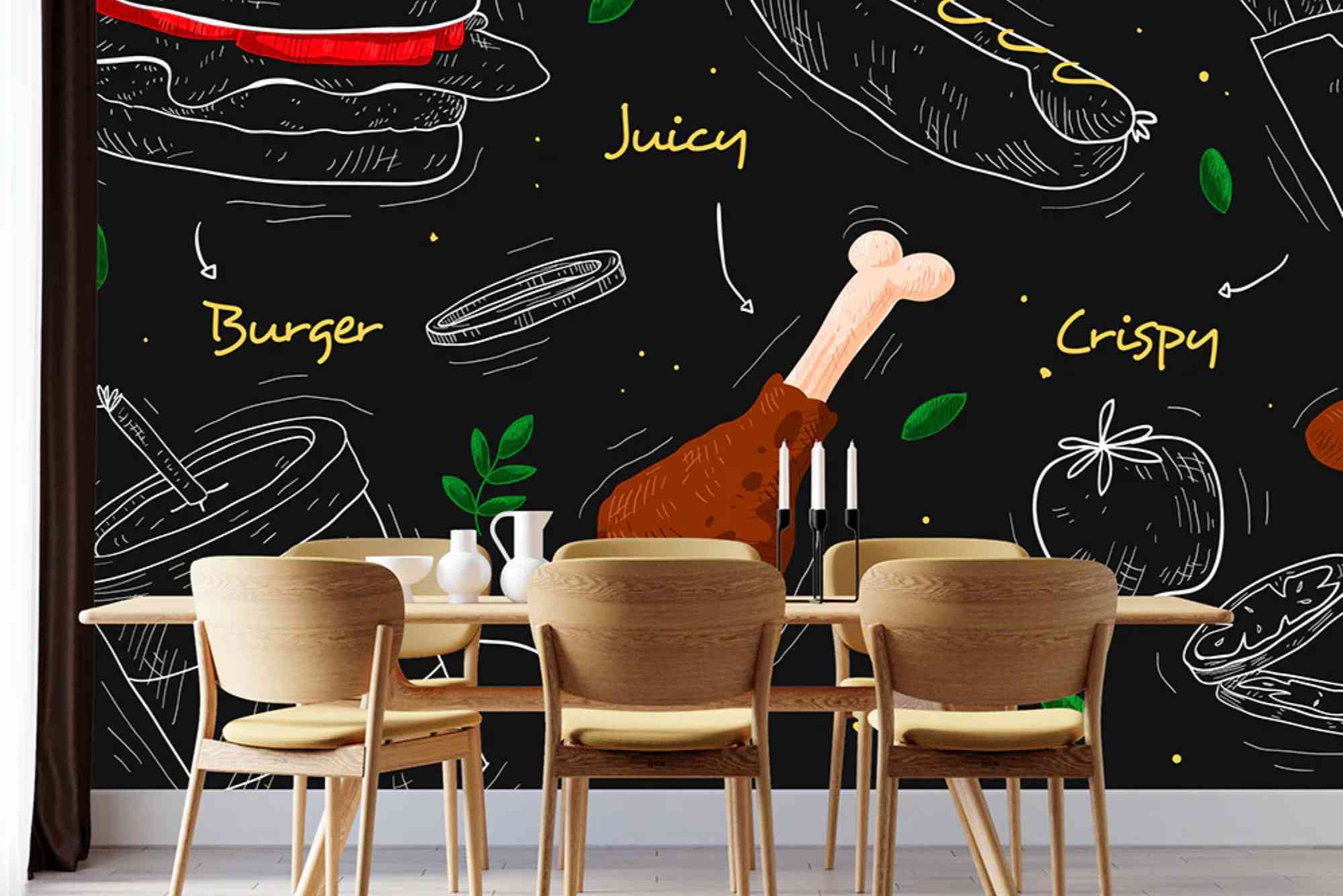
Using Photography as Backgrounds
Photos can be powerful background elements—but they must be used carefully. A full-bleed image of your signature dish or ingredients can create a mouth-watering backdrop, but only if text remains easy to read.
Use photo backgrounds with a slight blur or overlay to ensure your text stands out. Keep the most important text over areas with minimal detail, and consider desaturating the image to make it less visually competitive with the menu items.
Digital Menu Background Design
In the era of digital menus and QR codes, screen presentation is just as important as print. Digital menus allow for animation, subtle motion, or dynamic backgrounds that change based on the time of day or occasion.
Use high-resolution textures and ensure your background is optimized for screens of various sizes. Light patterns or gradients work well on digital menus, especially when layered behind interactive buttons or image galleries. Avoid heavy file sizes that can slow loading time.
Typography and Background Harmony
Even the most beautiful background will fail if the text isn’t readable. Typography must work in harmony with the background. Avoid overly busy patterns behind small fonts. If the background has high visual contrast, use text blocks with semi-transparent overlays.
Ensure sufficient padding between sections and avoid placing text too close to the edges. Use drop shadows or outlines when necessary to help light fonts stand out on darker backgrounds.
Tips for Designing a Standout Menu Background
Start with your brand’s identity. Choose colors and textures that reflect your cuisine, atmosphere, and customer base. Test designs in real lighting conditions. What looks good on a screen may be too dark or dull when printed.
Always prioritize readability. Use your background to support, not steal, attention. If in doubt, tone down the background and let your dishes speak for themselves. Invest in professional design help if needed. A graphic designer can create custom background textures that align perfectly with your brand story.
Make Your Menu Memorable
A creative and well-executed background design for food menu can elevate the customer experience from the moment they sit down. It’s a subtle but powerful tool that communicates style, quality, and emotion. Whether you choose minimalist textures, cultural motifs, bold colors, or seasonal themes, ensure your background enhances—not distracts from—your offerings.
Great menus do more than display food—they invite customers into your brand’s world. So take the time to create a background that serves not just your food, but your story. Ready to transform your menu? Start experimenting with background designs today and see how a simple change can make a delicious impact.
FAQs
What background is best for a food menu?
It depends on your brand. Neutral textures, soft gradients, or themed designs (like rustic wood or clean white) are popular and effective.
Can I use photos as a menu background?
Yes, but use them carefully. Choose high-resolution images, add overlays if needed, and make sure the text remains readable.
What colors stimulate appetite on a menu?
Warm tones like red, orange, and yellow are known to stimulate hunger and are often used in food branding.
Should background design match restaurant decor?
Ideally, yes. Your menu background should align with the ambiance, theme, and visual identity of your restaurant.
How can I update my menu design for seasons?
Use seasonal colors, patterns, and textures—like leaves for autumn or bright fruit designs for summer—to refresh your menu background while keeping the structure intact.
Are dark backgrounds good for food menus?
Dark backgrounds can work well if paired with high-contrast text. They’re great for upscale or night-themed menus but must maintain legibility.
What software can I use to design menu backgrounds?
Tools like Canva, Adobe Illustrator, Photoshop, or even menu-specific platforms like MustHaveMenus can help you create professional background designs easily.